Essential Tips for Finding the Best Custom Logo Design in 2025
Choosing a custom logo design in 2025 can feel overwhelming. You want your logo to speak for your brand, grab attention, and work everywhere you use it. Trends have changed a lot this year. Many brands now go for minimalism, using simple shapes and fewer colours. Others focus on custom typography to stand out, just like PayPal and Upwork did. Some logos even tell a story with bold visuals. You need something that fits your business and lasts, not just what looks good today.
Key Takeaways
Your logo is very important for your brand. It should show what your business stands for. It should also show your business’s personality.
Keep your logo simple. Simple logos are easy to remember. They also look good in many sizes and formats.
Pick your colours carefully. Colours can make people feel different things. Colours can also change how customers see your brand.
Try your logo in real-life situations. Make sure it looks nice on all backgrounds. Make sure it looks good in all sizes.
Ask your audience what they think. Their thoughts can help you make your logo better.
Make sure your logo works everywhere. It should look good on websites and on packaging.
Try to make your logo last a long time. It should still look good after many years. Do not use designs that are too trendy.
Look at what your competitors are doing. This helps you see what works in your industry. It can help you make a logo that stands out.
Logo Importance
Brand Identity
Your logo is the face of your business. When you choose a Custom Logo Design, you set the tone for how people see your brand. You want your logo to match your values and personality. If you run a tech shop, you might pick cool blues and sharp lines. If you sell eco-friendly products, you could use green and soft shapes. Colours and shapes in logos send messages without words.
The right colour palette helps people connect with your business.
Red can show excitement, while green hints at eco-friendliness.
Circles in logos suggest unity, while squares mean stability.
You can use surveys or ask your customers what they like. This helps you create a logo that fits your audience. When your logo matches your brand, people remember you. They feel good about buying from you.
Recognition
You want your shop to stand out. A strong logo makes this happen. When people see your logo, they should know it’s you. Think about big brands like Nike or Apple. Their logos are simple, but everyone knows them. You can build this kind of recognition for your own business.
Customers see your logo and feel your brand is reliable.
Distinctive logos help people remember your shop.
Using your logo everywhere makes it familiar and trusted.
If your logo looks good on your website, packaging, and social media, people will spot it easily. Consistency is key. You want your logo to look the same everywhere. This helps customers trust you more.
Tip: Test your logo in different places. See how it looks on a phone, a sign, or a business card. Make sure it always stands out.
Longevity
You want your logo to last for years. Trends change fast, but your logo should stay strong. If you pick a design that is too trendy, you might need to change it soon. Simple logos often last longer. They work well in black and white or colour. They look good in big or small sizes.
Logos with timeless shapes and colours stay fresh.
Simple designs are easier to update if you need a change.
A lasting logo saves you money and keeps your brand steady.
When you invest in a logo that fits your brand and stands out, you build trust. Customers will remember you for years. Your logo becomes a symbol of your business.
Logo Types
Wordmarks
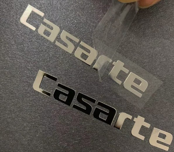
Wordmarks are logos that use your brand name as the main design. You see these everywhere. Google, Coca-Cola, and Visa all use wordmarks. You choose a special font or style that makes your name stand out. This type works best if your business name is unique or easy to remember. You want people to see your name and know who you are.
If you run a shop with a catchy name, a wordmark can help you build recognition. You can play with colours and spacing to make your logo pop. Simple wordmarks look clean and modern. They fit well on websites, packaging, and social media. You do not need extra symbols or pictures. Your name does all the work.
Tip: Pick a font that matches your brand’s personality. A playful shop might use rounded letters. A luxury brand could choose elegant, thin lines.
Lettermarks
Lettermarks use initials instead of full names. You see this with brands like IBM, BBC, and HBO. If your business name is long or hard to say, lettermarks make it easy for people to remember you. You create a logo using just a few letters. This style is simple and neat.
Lettermarks work well for companies that want a sleek look. You can use bold colours or shapes to make your initials stand out. This type of logo fits on small items, like pens or business cards. You do not need to worry about your name taking up too much space.
Lettermarks help you keep your logo short and sweet.
You can use creative fonts to show your brand’s style.
People remember your initials faster than a long name.
Brandmarks
Brandmarks are logos that use symbols or icons. You do not see any words or letters. Think of Apple’s apple or Twitter’s bird. These logos are easy to spot and remember. You choose a shape or image that tells your brand’s story. Brandmarks work best if your symbol is simple and clear.
If you want your shop to stand out, a brandmark can help. You can use a shape that matches your products or values. For example, a bakery might use a cupcake icon. A tech store could use a lightning bolt. Brandmarks look good on everything, from websites to packaging.
Note: Brandmarks need to be unique. Make sure your symbol does not look like someone else’s logo.
When you pick a logo type, think about your brand’s purpose. Wordmarks show off your name. Lettermarks keep things short. Brandmarks use pictures to tell your story. Many successful brands in 2025 use these styles to create strong, memorable logos. You can mix and match styles to find the best Custom Logo Design for your business.
Combination Marks
Combination marks mix text and symbols in one logo. You get the best of both worlds. You can use your brand name with a unique icon or image. This style gives you flexibility. You can use the text alone, the icon alone, or both together. Many famous brands use combination marks. Adidas, Burger King, and Lacoste all use this type.
You might want a combination mark if you want people to remember your name and your symbol. You can show your brand’s personality with colours, shapes, and fonts. If you run a coffee shop, you could use a coffee cup icon with your shop’s name. If you sell sports gear, you might use a bold font with a running shoe image.
Tip: Try your logo with just the icon or just the text. See which part stands out more. You can use the icon for social media and the full logo for your shop sign.
Combination marks work well for new businesses. People learn your name and your symbol at the same time. You can change the layout for different uses. You might use the icon on small items and the full logo on big banners. This style helps you build a strong brand identity.
Here’s a quick table to show when combination marks suit your shop:
Shop Type | Why Choose Combination Marks? |
|---|---|
New businesses | Easy to build name and symbol recognition |
Online stores | Flexible for website and app icons |
Local shops | Good for signs, packaging, and uniforms |
If you want a logo that grows with your business, combination marks are a smart choice. You get versatility and instant recognition.
Emblems
Emblems look like badges or seals. You see them on car brands, schools, and sports teams. Starbucks and Harley-Davidson use emblems. This style puts text inside a shape, like a circle or shield. Emblems feel classic and strong. They work well if you want your brand to look trusted and established.
You might pick an emblem if you want a logo that stands out on packaging or uniforms. Emblems often use bold colours and detailed designs. You can show tradition and quality with this style. If you run a bakery, you could use a round emblem with your shop’s name and a cake image. If you own a gym, you might use a shield with weights and your brand name.
Note: Emblems can be hard to read in small sizes. Test your logo on business cards and social media. Make sure the text stays clear.
Emblems suit brands that want a formal or vintage look. You can use them for certificates, product labels, or staff badges. This style helps you show your brand’s history and values. If you want a Custom Logo Design that feels official and memorable, emblems are a great option.
Custom Logo Design Criteria
Brand Fit
You want your logo to feel like it belongs to your brand. It should match your business values and speak to your audience. Before you start any design, think about who you want to reach. Are your customers young and trendy, or do they prefer something classic? Your logo needs to fit their style and expectations.
A logo that fits your brand helps people trust you. It shows you understand your industry and your customers. If you run a children’s shop, you might use bright colours and playful shapes. For a law firm, you might choose strong lines and deep blues. Always make sure your logo feels right for your business.
Here’s a quick look at why knowing your audience matters:
Audience Type | Logo Style That Works | Why It Matters |
|---|---|---|
Young, trendy crowd | Bold, modern, playful | Feels fresh and exciting |
Professional clients | Clean, classic, strong | Builds trust and shows expertise |
Eco-conscious buyers | Natural colours, soft shapes | Connects with values and lifestyle |
Tip: Never ignore your target audience. If your logo does not connect with them, it can hurt your brand’s image and make it harder for people to remember you.
Simplicity
Simple logos work best. You want people to remember your brand after just one look. When you keep your design clean, you make it easier for customers to recognise and recall your business. Our brains love simple patterns. They help us spot and remember brands quickly.
Let’s see how simplicity helps your logo:
Benefit of Simplicity | Why It Matters |
|---|---|
Quick recognition | People spot your brand faster |
Lasting impression | Simple logos stick in people’s minds |
Cuts through clutter | Your logo stands out, even in busy places |
Easy to remember | Less to process means better recall |
Reduces confusion | Customers know exactly who you are |
If you add too many details, your logo can get lost. People might not remember it. Minimalist logos also look good on everything, from business cards to billboards. You want your Custom Logo Design to be clear and strong, not crowded or confusing.
Versatility
Your logo needs to work everywhere. It should look great on your website, social media, packaging, and even tiny labels. A versatile logo keeps your brand looking the same, no matter where people see it. You might need different versions for different uses, like a full logo for your website and a simple icon for your app.
Here’s how you can check if your logo is versatile:
Test your logo in black and white. It should still look good without colour.
Try it on small and large items. Make sure it stays clear and easy to read.
Use it on different backgrounds. Your logo should stand out on both light and dark surfaces.
Create a few versions, like a main logo and a simple icon, to use in different places.
Note: Consistency is key. Your logo should always look the same, whether it’s on a business card or a billboard. This helps people recognise your brand everywhere.
A good Custom Logo Design adapts to any situation. It stays strong and clear, even when you change its size or colour. Brands that get this right build trust and make a lasting impression.
Timelessness
You want your logo to look good today and still work in five or ten years. Timelessness means your logo does not go out of style quickly. You see brands like Shell, Ford, and Levi’s keep their logos for decades. They make small changes, but the main look stays the same. You can do this too.
How do you create a timeless logo? Start with simple shapes and clear lines. Avoid trendy fonts or colours that might look old next year. Pick a style that matches your brand’s story. If you sell classic clothes, you might use elegant fonts and soft colours. If you run a tech shop, you could choose bold lines and modern shapes.
Here are some tips for making your logo timeless:
Use basic shapes like circles, squares, or triangles.
Choose colours that do not go out of fashion.
Avoid too many details or effects.
Test your logo in black and white.
Ask yourself, “Will this still look good in ten years?”
Tip: Show your logo to friends or customers of different ages. Ask them if it feels fresh or old-fashioned. If most people say it looks classic, you are on the right track.
A timeless logo saves you money and effort. You do not need to redesign it every few years. Your customers will remember your brand for a long time. You build trust and loyalty with a logo that stands the test of time.
Trend Adaptability
Trends change fast. You see new colours, shapes, and styles every year. Some brands jump on every trend, but this can confuse customers. You want your logo to feel modern, but not lose its identity. Trend adaptability means your logo can update with small tweaks, without changing the whole look.
How do you keep your logo adaptable? Start with a strong base. Use simple shapes and clear fonts. When a new trend comes, you can change a colour or add a small detail. You do not need to redesign everything. This keeps your brand fresh and up-to-date.
Let’s look at a table to see how you can adapt your logo to trends:
Trend Example | How to Adapt Your Logo | Why It Works |
|---|---|---|
New colour trend | Update accent colours | Keeps logo feeling modern |
Minimalism | Remove extra details | Makes logo cleaner |
Bold fonts | Swap to a thicker font | Adds impact |
Gradient effects | Add subtle gradients | Feels fresh, not overdone |
Note: Always test changes before you launch them. Ask your customers what they think. If they like the update, you know you are moving in the right direction.
You want your Custom Logo Design to stay flexible. This way, you can keep up with trends without losing your brand’s core look. You show customers that your business is modern, but also reliable. Adaptability helps you grow and stay ahead in a busy market.
Design Elements

Colour
Colour grabs attention first. You want your logo to stand out, but you also want it to send the right message. Colours have power. They make people feel things about your brand. If you pick blue, you show confidence and reliability. Green tells people you care about the environment. Purple feels glamorous. Pink looks youthful and creative. Yellow brings fun. Red shows expertise and self-assurance.
Here’s a quick look at how colours affect people:
Colour | Psychological Effect(s) |
|---|---|
Blue | Confidence, success, reliability |
Green | Environmental friendliness, toughness, durability, masculinity, sustainability |
Purple | Femininity, glamor, charm |
Pink | Youth, imagination, fashionable |
Yellow | Fun, modernity |
Red | Expertise, self-assurance |
You want to choose colours that match your brand’s personality. If you run a tech shop, blue might work best. If you sell eco-friendly products, green fits well. Try not to use too many colours. Simple colour schemes help people remember your logo. Test your logo on different backgrounds. Make sure it always looks clear.
Tip: Ask your customers what colours they like. Their answers can help you pick the right palette.
Shape
Shapes in logos do more than just look nice. They change how people see your brand. Thick shapes feel powerful. Circles show unity and friendliness. Squares mean stability. Triangles look dynamic and energetic. The shape you pick can make your brand feel strong or gentle.
Let’s see how shapes affect brand recognition:
Factor | Impact on Brand Recognition |
|---|---|
Visual thickness | Thicker logos feel more powerful and boost brand personality. |
Shape dynamics | The shape changes how people judge movement and reliability. |
Dynamic imagery | Even static logos can look like they move, making people more interested. |
You want your logo to look good in any size. Simple shapes work best. They stay clear on business cards, websites, and packaging. If your logo looks too busy, people might not remember it. Try different shapes and see which one fits your brand.
Note: Test your logo in black and white. If the shape still stands out, you know it works.
Font
Fonts speak for your brand. You want a font that matches your style and feels easy to read. Serif fonts look traditional and trustworthy. Sans-serif fonts feel modern and clean. Heavy fonts show strength. Light fonts feel elegant. Good font pairing makes your logo clear and helps people remember you.
Here’s how fonts affect your brand:
Aspect | Description |
|---|---|
Emotional Connection | Fonts help people feel connected to your brand. |
Brand Identity | Using the same font builds recognition. |
Conveyed Strength | Heavy fonts feel strong. Light fonts feel elegant. |
Font Pairing | Mixing fonts can make your logo easier to read and more memorable. |
User Experience | Clear fonts make your brand easy to understand and trust. |
Pick a font that matches your brand’s voice. If you want to look modern, use sans-serif. If you want tradition, use serif. Always choose simple, readable fonts. People should know your name at a glance.
Tip: Try your logo with different fonts. Show it to friends or customers. Ask which one feels right for your brand.
Testing Logos
Real-World Use
You want your logo to shine everywhere, not just on your computer screen. Testing your logo in real-world situations helps you spot problems before you launch. Try your logo on different backgrounds, like white, black, or even busy photos. Print it out on paper, stick it on a mug, or see how it looks on a T-shirt. You might notice that some colours fade or shapes get lost when you shrink the logo down.
Many companies use a few smart tricks to check logo effectiveness:
Test your logo on digital screens and printed materials.
Try it in small sizes, like app icons or business cards.
Place it on large banners or shop signs.
Use A/B testing to compare different versions and see which one people like more.
Watch how users interact with your brand online. Analytics can show if people recognise your logo or click on it more often.
Tip: Always check your logo in both colour and black-and-white. A strong logo works well in any situation.
You can also use data to make better choices. If you see that one version of your logo gets more attention or feels easier to spot, you know you are on the right track. Testing in the real world saves you time and money later.
Feedback
Getting feedback is key if you want a logo that truly connects with your audience. You might love your design, but your customers could see it differently. Ask people what they think before you make your final choice. There are many ways to collect feedback, and each has its own strengths.
Here’s a quick table to help you pick the best method:
Method | Pros | Cons |
|---|---|---|
Customer feedback forms | Target specific users, easy to customise | Need to attract people to your site first |
Feedback button | Quick and simple to use | Some users may ignore it |
Email surveys | Higher response rates, direct to users | Need a good email list |
Live chat or chatbots | Instant feedback, solves issues quickly | Balancing AI and human touch can be tricky |
Social media listening | Honest, unfiltered opinions | Needs monitoring tools |
Focus groups or interviews | Deep insights, real conversations | Time-consuming, not always scalable |
User behaviour analytics | Shows real actions, not just words | Misses personal opinions |
You can also listen to what people say on social media or after they buy from you. Sometimes, the best feedback comes from a quick chat or a simple question at checkout. Watch how people react to your logo in real life. Do they smile? Do they remember it? These small clues tell you a lot.
Note: Don’t just ask friends or family. Your real customers give the most honest answers.
Mix a few feedback methods to get a full picture. When you listen and adjust, you create a logo that people love and remember. Testing and feedback turn a good logo into a great one.
Custom Logo Design Process

Brand Brief
You start your logo journey by creating a brand brief. This step helps you understand what your business stands for. You write down your brand’s values, mission, and personality. You think about your target audience. Are you selling to families, young adults, or professionals? You also list your main products or services.
A good brand brief answers these questions:
What does your business do?
Who are your customers?
What makes your brand different?
What feelings do you want your logo to inspire?
When you have a clear brand brief, you make better choices during the design process. You know what colours, shapes, and fonts fit your brand. You also avoid designs that do not match your business. This step sets the foundation for a strong Custom Logo Design.
Tip: Share your brand brief with your designer or team. Everyone stays on the same page and works towards the same goal.
Research
Next, you dive into research. You look at your competitors and study their logos. This helps you spot market trends and see what works in your industry. You notice which colours and styles are popular. You also find gaps where your brand can stand out.
Competitor research gives you three big advantages:
You learn what your customers like.
You find unique elements for your logo.
You make sure your logo fits your brand identity.
You do not want a logo that looks like everyone else’s. You want something fresh and memorable. Research also helps you avoid mistakes. If you see a logo style that confuses people, you know to skip it. You get ideas for your own design and make smarter decisions.
Note: Take screenshots or make a mood board with logos you like and dislike. This visual guide helps you and your designer stay focused.
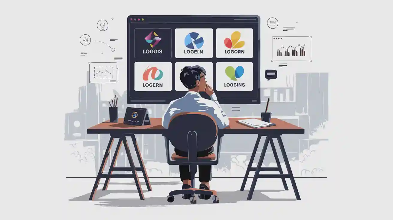
Designer vs Platform
Now, you decide how to create your logo. You can hire a professional designer or use an online logo platform. Each option has its pros and cons. Let’s look at them side by side:
Aspect | Hiring a Designer | Using a Logo Maker |
|---|---|---|
Cost | More expensive | Affordable or free |
Time | Takes longer | Quick and easy |
Customisation | Tailored to your brand | Limited options |
Quality | Unique, high-quality designs | Varies, may lack uniqueness |
Accessibility | Depends on designer’s schedule | Available any time |
Long-term value | Builds strong brand recognition | May not last as long |
If you want a logo that truly fits your brand, a designer gives you more control. You get a unique design and expert advice. You also get files ready for print and digital use. If you need a logo fast or have a small budget, a logo platform works well. You pick from templates and customise colours and fonts.
Tip: Try both options if you are unsure. Make a few drafts on a platform, then show them to a designer for feedback.
You choose the path that suits your needs and budget. No matter which you pick, make sure your logo matches your brand brief and stands out from the crowd.
Review
You have your first logo drafts. Now, it’s time to review them. This step helps you spot what works and what needs fixing. You want your logo to look great everywhere and feel right for your brand. Don’t rush this part. Take your time and look at each design with fresh eyes.
Start by asking yourself a few simple questions:
Does the logo match your brand’s personality?
Can you recognise it at a glance?
Does it look good in black and white?
Is the text easy to read?
Will it work on small items, like pens or app icons?
You can use a checklist to make things easier:
Review Checklist | Yes | No |
|---|---|---|
Brand fit | ✅ | ❌ |
Clear and readable | ✅ | ❌ |
Works in colour and mono | ✅ | ❌ |
Stands out from competitors | ✅ | ❌ |
Looks good in all sizes | ✅ | ❌ |
Tip: Print your logo and stick it on different things. Try it on a mug, a T-shirt, or a business card. You’ll see how it looks in real life.
Ask for feedback from your team, friends, or even customers. Sometimes, you miss small details that others spot straight away. Listen to their thoughts. You might hear that a colour feels wrong or a font is hard to read. Don’t be afraid to make changes. The best logos often go through many tweaks before they’re perfect.
If you work with a designer, share your feedback clearly. Tell them what you like and what you want to change. Good designers love honest feedback. They want your logo to shine as much as you do.
Note: If you feel stuck, take a break. Come back later with fresh eyes. You’ll notice things you missed before.
Reviewing your logo is not just about picking what looks nice. You want a design that works for your brand and stands out in the market. Careful review helps you avoid mistakes and gives you a logo you’ll love for years.
Mistakes to Avoid
Overcomplication
You might think a detailed logo looks cool, but too many details can make things worse. If you add lots of shapes or colours, your logo gets hard to spot. People may not remember it. When you shrink a busy logo, it can look blurry or messy. This is a problem for business cards or social media.
Here’s what happens if your logo is too complicated: Customers get mixed up and cannot tell it is your brand. The logo does not work well in different places. If you make it smaller, it can lose important parts or look fuzzy.
Simple logos are easier to remember. Think about the Nike swoosh or Apple’s apple. You want your logo to be clear and easy to see, on big signs or tiny stickers. Keep it simple, and people will notice you more.
Tip: If you are not sure, try taking away one thing at a time. See if your logo still works. Often, less is better.
Inconsistency
When your logo looks the same everywhere, people trust you more. If your logo changes on your website, packaging, or social media, customers might get confused. They may not know if it is the same business. You want your logo to always look the same, so people know it is you.
Tropicana made this mistake in 2009. They changed their packaging a lot, and shoppers could not find their favourite juice. Sales dropped by 20% in just a few weeks. People stopped trusting the brand because it looked different.
Use the same colours, shapes, and fonts on everything. This helps people remember you and trust your brand. When they see your logo, they know it is you.
Note: Make a simple style guide for your logo. Share it with your team so everyone uses the same design.
Poor Versatility
A good logo works everywhere. You want your logo to look great on a website, business card, or billboard. If your logo has fancy effects or tiny details, it might not show up well in every place. Some logos do not look good in black and white or on dark backgrounds.
Nike does this well. Their swoosh looks good on shoes, shirts, and screens. You should make your logo clear and easy to spot, no matter where it is.
Here is a table showing what to check for versatility:
Legibility at various sizes and distances |
Performance on light and dark backgrounds |
Recognition in animated/moving contexts |
Adaptability for different aspect ratios |
Effectiveness in both colour and monochrome applications |
Distinctiveness alongside competitor logos |
Do not use special effects or too many colours. Test your logo in different ways. Make sure it always looks sharp and stands out.
Tip: Try your logo in black and white, and on both light and dark backgrounds. If it still looks good, you have made a versatile logo.
Ignoring Trends
You might think trends do not matter when you design your logo. You want something that feels true to your brand. That makes sense. But if you ignore trends completely, your logo can look old-fashioned or out of touch. Customers notice when a brand feels stuck in the past. They want to see that you understand what is happening now.
Trends in logo design change every year. In 2025, you see more brands using bold colours, simple icons, and custom fonts. Some logos use gradients or playful shapes. Others go for a flat, minimal look. If your logo does not fit with what people expect, it can stand out for the wrong reasons.
Here are some problems you face if you ignore trends:
Your logo might look outdated next to your competitors.
Customers may think your business is not modern or innovative.
You could miss out on new ways to connect with your audience.
Your brand might not appeal to younger customers.
Tip: You do not need to follow every trend. Pick the ones that fit your brand and help you look fresh.
Let’s look at a quick table to see how trends can help or hurt your logo:
Trend Approach | Result for Your Brand |
|---|---|
Ignore all trends | Logo looks old, customers lose interest |
Follow every trend | Brand feels inconsistent, hard to trust |
Select trends wisely | Logo stays modern and true to your brand |
You want your logo to feel current, but not just trendy for the sake of it. Try these steps:
Watch what top brands in your industry do with their logos.
Notice which colours, shapes, or styles keep showing up.
Ask your customers what they like in modern logos.
Update small parts of your logo, like a colour or font, to keep things fresh.
Test new ideas before you make big changes.
Note: Trends can inspire you, but your brand story matters most. Use trends as a tool, not a rule.
When you pay attention to trends, you show customers that your business grows and adapts. You build trust and keep your brand looking sharp. A logo that feels both modern and timeless helps you stand out in 2025 and beyond.
Private Labelling
Benefits
Private labelling helps you stand out as a shop owner. You can make products that are only yours. This means shoppers cannot find them anywhere else. You control how your products look and feel. You also choose the price and how to sell them. This freedom makes your shop different from others.
Here are the main benefits:
Benefit | Description |
|---|---|
Unique Value Proposition | You make special products that help your shop stand out. |
You can earn more money than selling other brands. | |
Customised Pricing Control | You set your own prices to make more profit. |
Customised Marketing Control | You run your own ads and do not follow big brand rules. |
Adaptability | You can change your products quickly to match new trends. |
You also build loyalty with your customers. If people like your brand, they come back again. Private labelling lets you sell items that are only in your shop. This makes your shop the best place for something new. You get more profit and more control over your business.
Tangbuy Support
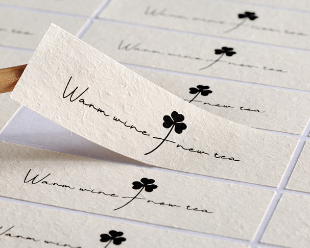
Tangbuy makes private labelling simple for you. They help you customise products without spending a lot. You can put your shop’s name on boxes and labels. This makes your brand look special and professional.
Here is what Tangbuy does for your shop:
Give private label choices for many products.
Help you design packaging that matches your brand.
Let you add your logo and shop name to every item.
Support influencers and creators who want branded products.
With Tangbuy, you do more than just sell things. You build a brand. Your customers will see your logo on every box and bag. This helps you create a strong brand that people remember.
Tip: Start with a few custom products and watch how your customers react. You can add more as your brand gets bigger.
Brand Integration
You want your logo to appear everywhere your customers see your brand. This is more than just your website. Think about social media, emails, packaging, and receipts.
Good brands keep their logo and message the same everywhere. Here are some ways to do this:
Make sure every customer experience matches your brand values.
Check your touchpoints often to keep things consistent.
Use your logo on your website, social media, packaging, and emails.
Plan how your brand should look and feel everywhere.
Keep your message the same on every channel.
When you use your logo in all these places, you build trust. Customers recognise your brand quickly. They know what to expect and feel closer to your shop. Consistency is important. It makes your business look professional and trustworthy, so people come back.
You want a logo that fits your brand and stands out everywhere. Start with research, brainstorming, and a clear design brief. Here’s a quick look at the process:
Phase | Description |
|---|---|
Research | Learn about your business, competitors, and audience. |
Brainstorming | Create ideas and refine designs with feedback. |
Importance of Design Brief | Set clear goals to keep your logo on track. |
Professional designers help you build trust and make your business memorable. They show your knowledge and honesty. Tangbuy gives you custom branding and private labelling support. Ready to create a logo that lasts? Take the first step today! 🚀
FAQ
What makes a logo “custom” instead of just a template?
A custom logo fits your brand. You work with a designer or use special tools to create something unique. Templates look generic. Custom logos help you stand out and show your business personality.
How much should I spend on a custom logo in 2025?
You can spend anywhere from £20 to £500 or more. Simple online tools cost less. Professional designers charge more but give you a unique result. Set a budget that matches your business goals.
Can I design my own logo if I am not a designer?
Yes, you can! Many online platforms make it easy. You pick colours, fonts, and icons. If you want something special, you can ask a designer for help.
How do I know if my logo works for my audience?
Ask your customers what they think. Show your logo on products or social media. Watch how people react. If they remember it and like it, you know it works.
Should I follow logo trends or stick to classic styles?
You can mix both. Trends help your logo look modern. Classic styles last longer. Pick what fits your brand best. Test small changes before making big updates.
What file types do I need for my logo?
You need files like PNG, SVG, and PDF. PNG works for websites. SVG and PDF are best for printing. Ask your designer for these files so your logo always looks sharp.
How often should I update my logo?
You do not need to update your logo often. If your business changes or your logo feels old, you can refresh it. Small tweaks keep your brand looking fresh without losing recognition.

TangBuy: A Smarter Way to Dropship in 2025
If you're looking to stay competitive with dropshipping in 2025, speed and trend-awareness are key. TangBuy helps you stay ahead with real-time product trends, fast fulfilment, and factory-direct sourcing. With over 1 million ready-to-ship items, 24-hour order processing, and seamless Shopify integration, TangBuy makes it easier to test, scale, and succeed in today's fast-moving eCommerce landscape.
See Also
Best Free Logo Creation Tools for Your Brand in 2025
Popular Custom Phone Cases for Successful Dropshipping in 2025
Current Trends for Grooms in Custom Wedding Suits 2025