How Experienced Sellers Choose a Custom Logo Design That Fits their Store

If you want your shop to stand out, you need more than just a catchy name. Experienced Sellers know a custom logo must fit the store’s brand and speak to the right customers. When your logo matches your brand identity, you build trust and keep shoppers coming back.
84% of customers say they’re more likely to stick with a brand that has a strong identity.
Research shows that shoppers who feel emotionally connected to a brand buy more and stay loyal longer.
Choosing the right logo is not just about looks—it’s a smart investment in your shop’s future.
Key Takeaways
A strong brand identity is very important. Decide what your main values are. These values help you make your logo.
Know who your target audience is. Learn about their age and interests. This helps you pick the best colours and fonts.
Make your logo simple and easy to remember. A clear logo looks good in any size. It works well on different platforms.
Use feedback from customers to improve your logo. Try out different designs to see which one people like most.
Look at your competitors to spot trends. See what works for them and what does not. This helps you make a logo that stands out.
Pick your colours carefully. Each colour makes people feel something different. Your colours should match your brand’s style.
Choose typography that fits your brand. The right font makes your shop look better. It also makes words easier to read.
Work with your designer closely. Give them a clear brief. Talk often to get the best results.
Brand Identity
Before you even think about colours or fonts, you need to get clear on your brand identity. This is the heart of your shop. It shapes how people see you and how you want them to feel when they visit your store. If you skip this step, your logo might look nice, but it won’t mean much to your customers.
Core Values
Your core values are the beliefs that drive your business. They tell your story and set you apart from the crowd. When you know what matters most to you, it becomes much easier to create a logo that feels right.
Core brand values define what your company is about.
They help create a unique identity for your business.
These values are key to differentiating your brand from the competition.
Core brand values are the foundation of your company culture.
They influence how you conduct business and interact with employees and customers.
Think about brands like Patagonia, Apple, Ben & Jerry’s, Starbucks, and Amazon. Each one stands for something special. Patagonia focuses on environmental sustainability. Apple is all about innovation. Ben & Jerry’s supports social justice. Starbucks cares about its employees. Amazon puts customers first. You don’t have to be a giant to have strong values. Even a small shop can stand out by showing what it believes in.
Personality
Your brand personality is the way your shop “acts” and “speaks.” Are you fun and playful, or serious and professional? Do you want customers to feel excited, relaxed, or inspired when they see your logo? Your logo should match this vibe. If you run a toy shop, you might want bright colours and a friendly font. If you sell luxury watches, you might choose sleek lines and a classic look.
Tip: Write down three words that describe your shop’s personality. Use these words to guide your logo choices.
Unique Proposition
What makes your shop different from everyone else? This is your unique proposition. Your logo should show off what makes you special. Experienced sellers often:
Choose a colour palette that reflects their brand personality and stands out from competitors.
Select fonts that are easy to read and match their brand’s character.
You can also use your customers’ own words to help shape your logo. Ask yourself:
How does your product make their lives better?
Why do people choose you over others?
When you answer these questions, you’ll find clues for your logo design. A logo that shows your values, personality, and unique proposition will help your shop connect with the right people and keep them coming back.
Target Audience
It is smart to know your target audience before making your logo. When you know who you want to reach, you can design a logo just for them. This helps your brand feel special and not boring.
Demographics
Think about the people who shop at your store. Are they teens, adults, or parents? Do they share a culture? What is their income? These things matter a lot. If you design for different groups, you connect better with them.
Knowing your audience’s age, gender, money, and culture helps you pick the right colours, fonts, and layout.
A logo that fits your customers’ style feels more friendly and honest.
Here is an easy way to start:
Make a buyer persona. Picture your perfect customer and write down their age, gender, hobbies, and lifestyle.
Pick colours that your audience likes. Bright colours may attract young people. Soft colours may be better for professionals.
Choose fonts that match your brand and suit your audience.
If you design with your audience in mind, your logo will stand out. Your marketing will also work better.
Preferences
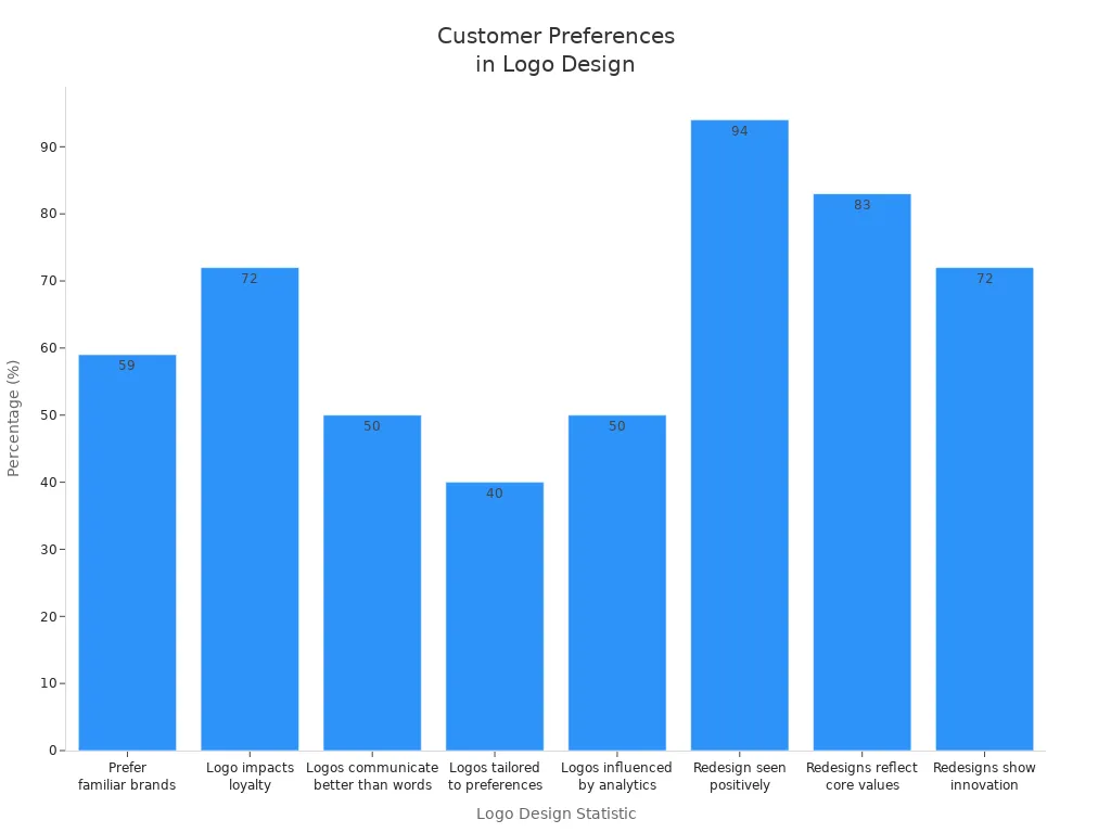
You want your logo to look nice and familiar to your customers. People trust brands they know. In fact, 59% of shoppers like brands they already know. If your logo looks friendly and matches what your audience likes, they will remember you.
Statistic | Value | Description |
|---|---|---|
59% | Consumers prefer familiar brands | People like brands they know and trust. |
72% | Businesses believe logo design impacts loyalty | A good logo keeps customers coming back. |
50% | Consumers believe logos communicate better than words | Your logo can say more than a slogan. |
40% | Logos tailored to customer preferences | Many brands now use customer data to shape their logos. |
50% | Logos influenced by data analytics | Analytics help brands design logos that work. |
94% | Consumers see redesign positively | Most people like it when a brand updates its logo. |
83% | Consumers want redesigns to reflect core values | Shoppers want logos to show what a brand stands for. |
72% | Consumers view redesigns as commitment to innovation | A new logo can show your brand is moving forward. |
Tip: Ask your customers what they like. Use surveys or social media polls to find out which colours, shapes, or styles they prefer.
Competitor Analysis
Look at what other shops like yours are doing. You can learn a lot from their logos. Notice which colours and styles are popular. Think about what makes their logos good or bad. This helps you see trends and find ways to be different.
Write down your top five competitors.
Look at their logos and note what you like and do not like.
Find a way to make your logo stand out, so people remember you.
If you know your audience and check your competition, you can make a logo that fits your shop well.
Experienced Sellers’ Approach
When you want a logo that truly fits your shop, you need to act like experienced sellers. They do not just pick the first designer they see. They follow a clear process to get the best results. Let’s look at how you can do the same.
Research

Experienced sellers start with research. They do not rush. You should look at different designers, styles, and prices. Take your time to compare options. This helps you spot trends and avoid mistakes.
Tip: Make a list of what you like and dislike about logos in your industry. This will help you explain your vision to a designer.
A good design brief is your secret weapon. It tells the designer exactly what you want. Here’s what you should include:
What you need (like a new logo or a full branding package)
The purpose of the design and where you will use it
Who makes the final decision
What files you expect (PNG, JPG, etc.)
Who your target audience is and what message you want to send
Your main goals and any calls to action
Your favourite styles or examples for inspiration
Your timeline, budget, and any extra details
A clear brief sets expectations, reduces confusion, and makes the whole process smoother.
Freelance Marketplaces
Many experienced sellers use freelance marketplaces to find the right designer. These platforms give you lots of choices. You can see different styles, prices, and reviews all in one place.
Here’s how you can evaluate designers on these sites:
Criteria | Description |
|---|---|
Proposals | Ask designers to share their approach, timeline, and pricing. |
Portfolios | Check their past work to see if their style matches your vision. |
Reviews | Read what other clients say about their work and reliability. |
Communication | Chat with designers before you order. Make sure they understand your needs. |
You should:
Review designer profiles, prices, and what they offer.
Read reviews from past clients.
Message the designer to talk about your project before you hire them.
This way, you avoid surprises and find someone who gets your brand.
Review Analysis
Experienced sellers never skip the reviews. They read what others say about each designer. This gives you real insight into the designer’s skills and attitude. Look for comments about communication, creativity, and how well the designer followed the brief.
Note: If you see lots of positive reviews about clear communication and fast delivery, that’s a good sign.
Do not be afraid to ask questions. Ask why the designer chose certain colours or shapes. Find out how they plan to make your logo stand out. The more you ask, the better your results.
Here are some questions you might ask:
Why did you pick these colours?
How will this logo look on different backgrounds?
Can you show me examples of similar work?
What happens if I want changes?
Experienced sellers know that asking detailed questions leads to a logo that truly fits their shop. You can do the same. Take your time, do your research, and do not settle for less than the best.
Logo Elements
Colour
Colour is one of the first things people notice about your logo. It can make your shop feel exciting, trustworthy, or eco-friendly. When you pick colours, think about what your brand stands for and how you want customers to feel. Different colours send different messages. Here’s a quick look at what some popular colours mean in retail:
Colour | Popularity | Psychological Effect |
|---|---|---|
Red | Popular | Grabs attention, generates appetite |
Blue | Popular | Creates a feeling of security and trust |
Green | Popular | Evokes nature, eco-friendliness, and savings |
Brown | Unpopular | Considered niche, not widely appealing |
Pink | Unpopular | Considered niche, not widely appealing |
Purple | Unpopular | Considered niche, not widely appealing |
If you want to grab attention, red works well. Blue helps you build trust. Green is great for eco-friendly shops. Try to choose colours that match your brand’s personality and appeal to your target audience. You also want your logo to look good in black and white, so it stays clear on any background.
Tip: Stick to two or three main colours. Too many colours can make your logo look messy.
Typography
Typography is the style of the letters in your logo. The font you choose says a lot about your shop. A modern font can make you look professional. A playful font can make your shop feel friendly and fun. Spacing between letters matters too. Good spacing makes your logo easy to read and shows you care about details.
Spacing helps with readability and makes your shop look organised.
Colour in your text can set the mood—bright colours grab attention, while softer tones feel calm.
Serif fonts (with little lines at the ends) feel classic and reliable. Sans serif fonts (without those lines) look modern and simple. If you want to stand out, pick a font that matches your shop’s vibe and use it everywhere. Consistent typography helps people remember your brand.
Remember: The right font can make your shop look trustworthy and unique.
Icon
An icon is a small picture or symbol in your logo. It helps people remember your shop. A good icon shows what your shop is about in a simple way. You want your icon to be easy to recognise, even when it’s small.
Simple, clear icons work best for online shops.
A strong icon makes your logo memorable and helps customers come back.
Experienced Sellers often choose icons that are easy to scale and look good on any device. If your icon is too detailed, it might not work well in small sizes. Keep it simple and make sure it fits your brand’s story.
Layout
When you think about your logo, you might focus on colours or fonts first. But layout is just as important. Layout means how you arrange all the parts of your logo—like the icon, text, and any extra details. A good layout makes your logo look balanced and easy to read. If you get the layout right, your logo will work everywhere, from your website to your packaging.
A strong layout helps your logo stand out. It guides your customer’s eyes to the most important part. You want people to see your brand name or icon first, not get lost in a messy design. Here are some things you should keep in mind:
Balance: Make sure your logo does not feel too heavy on one side. Spread out the elements so nothing looks crowded.
Alignment: Line up your text and icons neatly. This makes your logo look tidy and professional.
Spacing: Leave enough space between each part. Crowded logos are hard to read, especially on small screens.
Hierarchy: Decide what you want people to notice first. Put the most important part in the best spot.
Tip: Print your logo in different sizes. If it still looks good when it’s small, your layout works well.
You also need to think about where you will use your logo. Sometimes you need a wide logo for your website header. Other times, you need a square version for social media. The best logos have layouts that you can change without losing their style.
Layout Type | Best For | Example Use Case |
|---|---|---|
Horizontal | Website headers, business cards | Online shops, banners |
Vertical | Product packaging, labels | Clothing tags, bottles |
Stacked/Square | Social media, app icons | Instagram, mobile apps |
If you want your logo to last, keep the layout simple. Simple layouts look modern and never go out of style. Complicated logos can feel old-fashioned quickly. You want your logo to look fresh for years.
Here’s a quick checklist for a timeless layout:
Can you use your logo in black and white?
Does it look good on both light and dark backgrounds?
Is it easy to read at any size?
Can you use it in different shapes (square, rectangle, circle)?
If you answer “yes” to these questions, you have a versatile logo. Remember, your layout should fit your brand and your audience. A playful shop might use a fun, off-centre layout. A luxury brand might choose a classic, centred design. Trust your instincts and test different options. Your perfect layout is out there!
Logo Types
Wordmark
A wordmark logo uses your shop’s name as the main design. You see this style with brands like Google or Coca-Cola. If you want your name to stand out and be easy to remember, a wordmark is a great choice. You do not need an icon—just strong, clear text.
Here’s what makes a wordmark logo work well in retail:
Characteristic | Description |
|---|---|
The font should match your shop’s personality. Custom letters help you look different. | |
Clarity and Readability | Good spacing and neat lines make your logo easy to read, even when it’s small. |
Strategic Use of Colour | Colours can show your brand’s mood—blue for trust, red for excitement, green for eco-friendly. |
Scalability and Adaptability | Your logo should look sharp on a website, a business card, or a delivery box. |
If you run a fashion boutique, a wordmark with elegant letters can feel high-end. For a tech shop, a modern, bold font works well. You can use colour to show your shop’s energy or calmness. Wordmarks are simple, but they can be very powerful.
Tip: If your shop’s name is short and catchy, a wordmark helps people remember you.
Lettermark
A lettermark logo uses just the initials of your shop’s name. This style is perfect if your business name is long or hard to say. Think of brands like IBM or H&M. You can make your logo short and snappy, which helps customers remember you.
Here are some common reasons to pick a lettermark logo:
Scenario Type | Example | Reason |
|---|---|---|
IBM (International Business Machines) | Your name is too long for a logo. | |
Complex Name | H&M (Hennes and Mauritz) | Your name does not show what you sell. |
Personal Branding | Freelance Web Designer | You use your own name for your shop. |
If you sell handmade crafts and your shop’s name is long, using your initials can make your logo look neat. Lettermarks also work well for personal brands. You can use bold or creative fonts to show your style.
Note: Make sure your initials are easy to read and do not look confusing.
Emblem
An emblem logo puts your shop’s name or initials inside a shape, like a badge or seal. This style feels classic and trusted. You see emblems with car brands, coffee shops, and schools. If you want your shop to look established and professional, an emblem is a strong choice.
Emblem logos offer several benefits:
Advantage | Description |
|---|---|
Emblems show your shop has history and authority. | |
Strong Brand Recognition | The compact shape makes your logo easy to spot and remember. |
Timeless Appeal | Emblems look classic and never go out of style. |
Creates a Unified Brand Identity | The enclosed design keeps your branding neat and consistent. |
Versatile Across Industries | Emblems work for many types of shops, from bakeries to sports teams. |
If you run a bakery, an emblem with a rolling pin or loaf of bread can make your shop feel warm and welcoming. For a barbershop, a badge-style logo can show tradition and skill. Emblems look great on signs, packaging, and uniforms.
Tip: Keep your emblem simple so it stays clear when you use it in small sizes.
Combination
A combination logo mixes text and an icon or symbol. You get the best of both worlds. Your shop’s name stands out, and the icon helps people remember you. Many experienced sellers choose this style because it works for almost any business.
You see combination logos everywhere. Look at Adidas. The brand uses its name with the famous three stripes. Burger King puts its name inside a burger shape. Lacoste uses a crocodile next to the brand name. These logos are easy to spot and work well on products, websites, and social media.
Why pick a combination logo? You want flexibility. You can use the full logo on your shop sign. You can use just the icon on your packaging or social media profile. This style helps you build a strong brand that people recognise in different places.
Here are some reasons why a combination logo might suit your shop:
You want your name and symbol to work together.
You need a logo that looks good in colour and black and white.
You plan to use your logo in many places, like online, in print, and on products.
You want to stand out from competitors who use only text or only icons.
Tip: Test your combination logo in different sizes. Make sure the text and icon are clear, even when small.
Let’s look at how you can design a combination logo that fits your shop:
Start with your brand name. Choose a font that matches your shop’s personality.
Pick an icon that shows what you sell or what you stand for.
Arrange the text and icon so they look balanced. Try different layouts—side by side, stacked, or with the icon above the name.
Use colours that match your brand and appeal to your target audience.
Check that your logo looks good on light and dark backgrounds.
Here’s a table to help you decide if a combination logo is right for you:
Shop Type | Example Brand | Why It Works |
|---|---|---|
Sportswear | Adidas | Icon and name are both memorable |
Fast Food | Burger King | Name inside a burger shape |
Fashion | Lacoste | Crocodile icon with brand name |
Tech Start-up | Slack | Speech bubble icon and wordmark |
Coffee Shop | Costa Coffee | Coffee bean icon with shop name |
You can change your combination logo for different uses. Use just the icon for your app or social media. Use the full logo for your website or packaging. This gives you more options than other logo types.
A combination logo helps you build a brand that people remember. You get flexibility, style, and a strong identity. If you want your shop to stand out, this style is a smart choice.
Working with Designers
Choosing the right designer can make all the difference for your shop’s logo. You want someone who understands your vision and can bring it to life. Let’s break down how you can work with a designer to get the best results.
Choosing a Designer
You have many options when it comes to picking a designer. Some people go with freelancers, while others choose agencies. No matter which route you take, you should look for certain qualities. Here’s a handy table to help you spot the best candidates:
Qualification/Criteria | Description |
|---|---|
Original Designs | Can they create unique logos that show off your brand’s identity? |
Understanding of Branding | Do they know how to turn your shop’s goals into a strong visual message? |
Effective Communication | Will they listen to your ideas and keep you updated during the process? |
Pricing Transparency | Are their prices clear, with no hidden fees? |
Proven Work History | Do they have a portfolio that shows their skills and flexibility? |
You want a designer who ticks all these boxes. Ask to see their past work. Check if their style matches what you want. Read reviews from other clients. If you feel comfortable talking with them, that’s a good sign.
Tip: Trust your gut. If a designer seems excited about your project and answers your questions clearly, you’re on the right track.
Design Brief
A clear design brief helps you and your designer stay on the same page. This is your chance to share your ideas, goals, and must-haves. You don’t need fancy words—just be honest about what you want.
Here’s what to include in your brief:
Your shop’s story and what makes it special.
The message you want your logo to send.
Colours you love (or hate).
Any shapes or icons you want to see.
The style you prefer—modern, playful, classic, or something else.
Where you plan to use your logo (website, packaging, social media).
If you give your designer this info, you’ll save time and avoid confusion. Experienced Sellers always prepare a strong brief before starting a project.
Note: Pictures help! Share logos you like or dislike. This gives your designer a clear idea of your taste.
Key Questions
Before you start, ask your designer some important questions. This helps you see if they understand your brand and can deliver what you need. Here are some smart questions to ask:
Key Questions for Designers to Ensure Brand Alignment |
|---|
Are they drawn to bold and vibrant hues, or more subdued and soft tones? |
Do you have any specific typography or font styles in mind? |
How would you describe your brand's visual style (e.g., minimalist, sophisticated)? |
Are there specific design assets that you've already produced or want to use? |
What marketing materials do you anticipate needing (e.g. brochures, website)? |
Describe your current or desired presence on social media. |
How do you intend to reach your ideal customer? |
What makes your brand’s offering unique against competitors? |
What are your brand's short and long-term objectives? |
Where do you envision your brand in 1, 3, and 5 years? |
How do you plan to implement the branding strategy in your business operations? |
You can also ask:
Who is your ideal customer? What do they like?
How do you want people to talk about your shop?
What makes your shop different from others?
Are there brands you admire? Why?
Asking these questions helps you and your designer work as a team. You’ll get a logo that fits your shop and stands out in the market.
Testing and Feedback
Customer Feedback
You want your logo to connect with real people, not just look good on your screen. Testing your logo with your target customers helps you see what works and what does not. Experienced sellers use several smart ways to gather honest opinions before making a final choice.
Here are some popular methods:
Method | Description |
|---|---|
A/B Testing | Show two different logo versions to separate groups. Compare which one gets better reactions or clicks. |
Focus Groups | Bring together a small group of customers. Ask them what they think about each logo option and why. |
Online Surveys | Share your logo ideas in a survey. Collect feedback from a wider audience to spot trends and preferences. |
Social Media Polls | Post your logo options on your social channels. Let your followers vote and comment. |
You can start by posting a poll on Instagram or Facebook. Ask your customers which logo they like best. You might be surprised by their answers! If you want deeper insights, run a focus group or send out a quick survey.
Big brands often collect feedback from many sources. They use surveys, social media, and even direct messages. Some use special tools to group feedback into themes and spot what people like or dislike. When you listen to your customers, you show them that their opinions matter.
Tip: Always thank your customers for their feedback. Let them know how you use their ideas to improve your brand.
Iteration
You rarely get the perfect logo on the first try. The best sellers treat logo design as a process. You test, tweak, and test again until you get it right.
Here’s a simple way to refine your logo step by step:
Step | Description |
|---|---|
1. Write Your First Prompt | Describe your logo idea clearly. Include your brand’s story, colours, and style. |
2. Review the Results | Look at the first designs. Check if they match your brand and feel right. |
3. Refine Your Prompt | Change your instructions based on feedback. Add details or fix what does not work. |
4. Generate New Versions | Create new logo options with your updated ideas. |
5. Track Your Progress | Keep notes on what you changed and why. This helps you learn and improve faster. |
You can repeat these steps as many times as you need. Each round brings you closer to a logo that fits your shop and pleases your customers.
Note: Share each new version with your team or a few loyal customers. Fresh eyes spot things you might miss.
Versatility
A great logo looks good everywhere—on your website, social media, packaging, and even tiny business cards. You want your logo to stay clear and recognisable, no matter where you use it.
Follow these steps to make sure your logo works across all platforms:
Keep your logo consistent. Use the same colours and style on every channel.
Create different layouts. Make a wide version for your website and a square one for social media.
Test your logo on light and dark backgrounds. Make sure it always stands out.
Check that your logo stays sharp and readable at any size. Use a simple version for small spaces.
If your logo passes these tests, you know it’s ready for the real world. A versatile logo helps your brand look professional and trustworthy everywhere your customers find you.
Remember: The more places your logo looks great, the stronger your brand becomes.
You have learned how skilled sellers pick a logo that suits their shop and attracts customers. There are some problems you might face. Sometimes, clients do not explain what they want. This can make things unclear. Many shops look alike, so it is tough to be different. People from different cultures see colours and symbols in their own way. Your logo needs to look good on phones, tablets, and computers. If you follow every step, your logo will be easy to remember and work well. Tangbuy helps you grow your brand. They connect you with trusted suppliers. You get prices straight from the factory. They also help with special packaging and check the quality for you.
FAQ
How do I know if my logo fits my brand?
Ask yourself if your logo shows your shop’s values and personality. Show it to friends or customers. If they feel the right vibe, you’re on the right track.
Can I design my own logo, or should I hire a professional?
You can try making your own logo with online tools. If you want a unique and polished look, a professional designer can help you stand out.
What file types do I need for my logo?
You’ll want PNG for web, SVG for scaling, and PDF or EPS for printing. Ask your designer for these files so your logo always looks sharp.
How many colours should my logo have?
Stick to two or three main colours. Too many colours can make your logo look messy. Simple colour schemes are easier to remember and print.
Will my logo work on social media and packaging?
Test your logo in different sizes and backgrounds. If it stays clear and easy to read everywhere, you’ve got a winner.
How often should I update my logo?
You don’t need to change your logo often. Update it if your brand changes or if your logo feels old-fashioned. Small tweaks can keep it fresh.
What if I don’t like the first logo design?
Don’t worry! Give feedback to your designer. Most designers expect to make changes. You can ask for tweaks until you feel happy with the result.
Do colours mean different things in other countries?
Yes, colours can have different meanings around the world. If you sell to many countries, check what your colours mean in those places.
Tip: Always test your logo with real customers before you launch it.

TangBuy: A Smarter Way to Dropship in 2025
If you're looking to stay competitive with dropshipping in 2025, speed and trend-awareness are key. TangBuy helps you stay ahead with real-time product trends, fast fulfilment, and factory-direct sourcing. With over 1 million ready-to-ship items, 24-hour order processing, and seamless Shopify integration, TangBuy makes it easier to test, scale, and succeed in today's fast-moving eCommerce landscape.
See Also
Best Free Logo Creation Tools for Your Brand in 2025
Comparing Shopify and WooCommerce: Which Suits Your Business?
Why Wholesale Zodiac Sign Necklaces Are Essential for Your Store
Advantages of Private Label Coffee Mugs for New Dropshippers