How to Select a Custom Logo That Perfectly Matches Your Brand as a Beginner
You might wonder how you can select a custom logo that truly matches your brand when you’re just starting out. A great logo feels simple and easy to recognise. It shows what your brand stands for. You don’t need design skills to create something special. With a few clear steps, you can make a logo that feels right for you.
Key Takeaways
A logo shows what your brand is. It should show your values and personality.
Simple logos are best. They are easy to remember. They look good in many sizes.
Think about your audience. Make your logo connect with them.
Pick your colours carefully. Colours make people feel different things. Colours can help people trust your brand.
Try your logo in many places. Make sure it looks good on websites, social media, and print.
Ask others for feedback. Honest opinions help you improve your logo.
Do not copy other logos. Your logo must be unique. This helps people trust your brand.
You can hire a professional designer. They can make a great logo that stands out.
Logo Importance
Brand Identity
A logo is not just a picture. It is the face of your brand. People see your logo and think about your business. Your logo should show what you believe in. It should also show your brand’s personality. A strong brand identity helps you stand out. It also makes your business easy to remember.
Logos help make a good first impression. They show what a business believes in and its personality.
Unique logos help customers recognise brands easily.
Think about famous brands. Their logos tell you what they believe in. You can do this for your business too. Pick colours and shapes that fit your style. Make sure your logo matches your brand. If you do this well, people will remember you.
Recognition
You want people to notice your brand quickly. A good logo helps with this. It makes your business easy to spot, even from far away or in a busy place. Studies show most people look at logos when they decide if they trust a brand.
75% of consumers decide if a brand is trustworthy by looking at its logo.
94% of consumers think a logo is very important for recognising a brand.
If your logo is clear and different, people will remember it. You can use your logo on your website, social media, and products. This keeps your brand in people’s minds. If you use your logo the same way everywhere, your brand looks strong.
Trust
Trust matters for every business. Your logo can help you build trust. People often decide if you are professional by looking at your logo. If your logo looks good, people think your brand is reliable. Studies show logo design can change how people feel about luxury brands.
Study | Findings |
|---|---|
1a & 1b | Shows a link between logo complexity and luxury in real brands. |
2 | Proves that logo complexity can make a brand seem more luxurious. |
3 | Shows this effect comes from how well the logo looks made. |
4 | The effect is weaker if people know more about how the logo was made. |
5 | The effect changes if people already know the brand. |
6 | People are more likely to follow a luxury brand’s social media if it has a complex logo. |
If you want people to trust your brand, focus on your logo. Make sure it looks good and fits your business. When people trust your logo, they are more likely to buy from you. They might also tell others about you. Your logo is small, but it can have a big impact.
Know Your Brand
Before you start designing your logo, you need to know your brand inside out. This step helps you create a logo that feels right and speaks to your audience. Let’s break it down into three simple parts: values, audience, and industry.
Values
Your brand values are the heart of your business. They shape how people see you and what you stand for. If you want your logo to feel genuine, you need to define these values first.
Think about what matters most to your business. Is it sustainability, innovation, honesty, or something else?
Make sure your business goals match your core values. This keeps your message clear and consistent.
Ask yourself: What is your company’s mission? What do you want to achieve?
List the benefits and features of your products or services. What makes you different?
Consider what your customers already think about your company. Do you want to change or strengthen that image?
Decide which qualities you want people to associate with your brand. Maybe you want to be seen as friendly, reliable, or creative.
Tip: When your values match your team’s beliefs and your customers’ expectations, you build trust and loyalty.
Audience
You want your logo to connect with the right people. To do this, you need to know who your target audience is. Many beginners make the mistake of designing for themselves, not for their customers.
Don’t base your branding on personal taste. Focus on what your audience likes and needs.
Avoid a generic approach. If you try to please everyone, you might end up pleasing no one.
Take time to research your audience. Find out their age, interests, and what problems they want to solve.
Think about how your products or services help them. What do they care about most?
Make sure your branding speaks directly to your ideal customer.
If you understand your audience, your logo will feel more personal and effective.
Industry
Your industry sets the stage for your brand. It’s smart to look at what others in your field are doing, but you also want to stand out.
Notice how top brands use familiar elements and update them slowly. This keeps their logos fresh but recognisable.
Choose a logo that works everywhere—on websites, packaging, and social media.
Keep your design simple. Simple logos are easier to remember and use.
Make sure your logo matches your other brand elements, like colours and fonts.
Use classic design ideas so your logo stays stylish for years.
Add a symbol or story that connects with your audience emotionally.
Staying up to date with design trends helps your brand stay relevant. Trends show what people like and how technology changes. When you know what’s popular, you can create a logo that feels modern but still true to your brand.
Note: Analysing competitor logos helps you spot what works and what doesn’t. It also shows you how to be different in a crowded market.
Logo Types
Choosing the right type of logo can feel confusing at first. You have many options, but each style sends a different message. Let’s look at the most common types you’ll see and help you decide which one fits your brand best.
Description | Examples | |
|---|---|---|
Wordmark | Focuses on stylised typography using the brand name as the primary element. | Coca-Cola, FedEx |
Lettermark | Utilises initials or letters for simplicity and memorability. | IBM, HBO |
Brandmark | Relies on a distinct visual symbol or icon without text. | Nike swoosh, Apple logo |
Combination Mark | Combines typography and symbols/icons for a unified logo. | Burger King, Doritos |
Emblem | Features a symbol or icon enclosed within a shape, often with text. | Harley-Davidson, Starbucks |
Wordmarks
Wordmarks use your brand’s name as the main feature. You see this style with brands like Coca-Cola and FedEx. The design focuses on the way the letters look. You can choose a unique font, play with spacing, or add a small twist to make it stand out.
Wordmarks work well if your brand name is short and catchy.
They help people remember your name because it’s always front and centre.
You don’t need a symbol or icon, just strong, clear lettering.
Tip: If you want your brand name to be the star, a wordmark is a great choice. It’s simple, direct, and easy to use on everything from business cards to websites.
Lettermarks
Lettermarks use only the initials of your brand. Think of IBM or HBO. These logos keep things short and sweet. If your business has a long name, a lettermark can make it easier for people to remember.
Lettermarks are neat and tidy. They fit well on small items like pens or social media icons.
You can use bold or creative fonts to make your initials stand out.
This style works best if your initials are easy to say or look good together.
A lettermark helps you create a strong identity without using your full name. It’s a smart move if you want a modern, minimal look.
Symbols
Symbols, also called brandmarks, use a picture or icon instead of words. The Nike swoosh and Apple’s apple are famous examples. These logos can be powerful because people remember images quickly.
Symbols work well if you want your brand to feel global or universal.
You don’t need to rely on language, so your logo can reach more people.
A simple, bold icon is easier to recognise at a glance.
Note: If you’re just starting out, you might want to pair a symbol with your brand name until people know your logo.
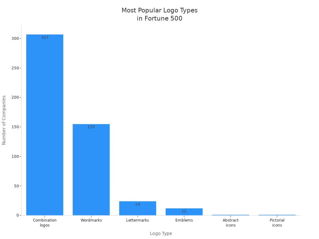
You might wonder which logo types are most popular with big companies. Take a look at this chart. It shows that combination logos and wordmarks lead the way among Fortune 500 brands.
When you pick your logo type, think about your brand’s name, your audience, and where you’ll use your logo. Each style has its own strengths. Choose the one that feels right for your story.
Combination
Combination logos mix text and symbols to create a unique look. You see these everywhere. Brands like Burger King and Doritos use them. You get the best of both worlds—a name and a picture. This style helps people remember your brand faster.
Why do beginners love combination logos?
You can show your brand name and a symbol together.
People recognise your logo even if they forget your name.
You can use just the symbol or just the text when you need to.
Tip: If you want flexibility, choose a combination logo. You can use the full logo on your website, then just the icon on social media.
Here’s a quick table to show how combination logos help you:
Benefit | How It Helps You |
|---|---|
Versatility | Use text, symbol, or both as needed |
Recognition | People remember your brand faster |
Storytelling | Show your brand’s message with images |
Adaptability | Works on products, ads, and packaging |
You might wonder how to design a combination logo. Start with your brand name. Pick a font that matches your style. Next, add a symbol that shows what you do or what you believe in. Keep it simple. Too many details make your logo hard to read.
Note: Test your logo in black and white. If it still looks good, you know it’s strong.
Combination logos work for almost any business. You can change the layout for different uses. For example, you might stack the symbol above the text or place it beside the name. Try different ideas until you find one that feels right.
Emblems
Emblem logos look classic and strong. You see them on badges, seals, and crests. Brands like Harley-Davidson and Starbucks use emblems. These logos put text inside a shape, like a circle or shield.
Emblems give your brand a sense of tradition. People trust logos that look official. You might want an emblem if you run a school, café, or club. They work well for groups that want to show history or authority.
Here are some features of emblem logos:
Text sits inside a shape, often with a border.
The design feels solid and complete.
Emblems look great on uniforms, signs, and packaging.
Alert: Emblems can be tricky for small spaces. If your logo has lots of details, it might not look clear on business cards or social media icons.
You can make your emblem simple or detailed. Some brands use bold colours and thick lines. Others choose soft colours and gentle shapes. Think about where you will use your logo. If you need it for small items, keep the design clean.
Here’s a quick checklist for designing an emblem logo:
Choose a shape that fits your brand.
Place your name or initials inside the shape.
Add symbols or images that show your story.
Test the logo at different sizes.
Emblems help you stand out. They make your brand look trustworthy and established. If you want a logo that feels official, an emblem is a smart choice.
Logo Elements
Colour
Colour is one of the first things people notice in a logo. You might not realise it, but the colours you choose can change how people feel about your brand. Colours can make your logo stand out or blend in. They can even affect how much people trust your business.
Here’s a quick look at how different colours can shape what people think:
Colour | Effect on Consumer Perception |
|---|---|
Blue | Increases quality and trustworthiness. People rate websites with blue as more trustworthy than those with green. |
You can use colour to boost brand recognition. Studies show that colour can improve how well people remember your brand by up to 80%. That’s huge! When you pick a colour palette, try to keep it consistent across your website, packaging, and social media. This helps people recognise your brand wherever they see it.
Colours have a big impact on emotions and behaviour.
Different colours mean different things in different cultures. For example, red can mean luck in some places, but danger in others.
Tip: Think about your audience and where they live. Choose colours that match their feelings and expectations.
Colours also influence mood and even physical reactions. Some colours can make people feel calm, while others might make them feel excited or alert. If you want your brand to feel trustworthy, blue is a safe bet. If you want energy, try red or orange. Always test your colours to see how they look together.
Typography
Typography is all about the style of letters in your logo. The font you pick can say a lot about your brand. You might want something sleek and modern, or maybe warm and friendly. The right font helps you connect with your audience.
The right font speaks to your target group and shapes how they see your brand.
Sleek, modern fonts attract people who like new ideas.
Script fonts feel personal and exclusive, perfect if you want a cosy vibe.
Think about brands like Coca-Cola and Google. Their logos use special fonts that make them easy to spot. FedEx uses a clever arrow in its letters to show speed and precision. Netflix and Spotify have custom fonts that make their logos unique and memorable.
Typography shapes brand perception from the first glance.
Different typefaces create different emotions and match your brand’s values.
Keeping your font style the same everywhere makes your brand stronger and easier to recognise.
Note: If you use too many fonts, your logo can look messy. Stick to one or two styles for a clean look.
Shape
Shapes in your logo can send silent messages. Circles feel friendly and safe. Squares and rectangles look strong and reliable. Triangles can show movement or energy. You don’t need to be an artist to use shapes well. Just think about what you want people to feel when they see your logo.
Circles suggest unity and community.
Squares and rectangles stand for stability and trust.
Triangles point to action and progress.
Shapes help guide the eye and make your logo easy to remember. Simple shapes work best because they look good at any size. If your logo has too many details, it might get lost on small screens or business cards.
Tip: Test your logo in black and white. If the shapes still look clear, you’ve got a strong design.
Shapes, colours, and typography all work together. When you get them right, your logo will feel just right for your brand.
Simplicity
When you think about logos, you might picture something fancy or detailed. But the truth is, the best logos are often the simplest ones. Simplicity makes your logo easy to spot, easy to remember, and easy to use everywhere. You do not need lots of details or special effects. You just need a clear idea that stands out.
Let’s look at some famous logos that use simplicity to their advantage:
Logo Example | Description |
|---|---|
McDonald's | The golden arches are simple and bold, allowing for instant recognition without words. |
Uniqlo | A clean, minimal logo that reflects modernity and is effortlessly recognisable. |
General Principle | Simple logos are easier to recognise and remember, providing clarity and consistency. |
You can see that these brands do not rely on complicated images. They use basic shapes and strong colours. This helps people recognise them straight away, even from far away or on a tiny screen.
Why does simplicity work so well? Here are a few reasons:
Your brain loves simple patterns. You can spot and remember them much faster than complex designs.
Simple logos look good on anything—websites, business cards, T-shirts, or even tiny app icons.
A clean logo gives your brand a modern, confident feel.
People connect with simple logos. They can trigger instant recognition and even emotional responses.
Think about the golden arches of McDonald’s. You do not need to see the name to know what it means. The same goes for Uniqlo’s neat, red square. These logos stick in your mind because they do not try to do too much.
If you want your logo to work everywhere, keep it simple. Avoid too many colours, shapes, or words. Test your design by shrinking it down. If you can still tell what it is, you are on the right track.
Tip: Try drawing your logo from memory. If you can do it easily, your design is simple enough.
Simplicity also helps your brand stay flexible. You can use your logo on social media, packaging, or even as a tiny icon. It will always look clear and professional. When you keep things simple, you make your brand stronger and more memorable.
So, when you start designing, remember: less is more. Focus on one strong idea. Let your logo speak for itself. Your future customers will thank you for it.
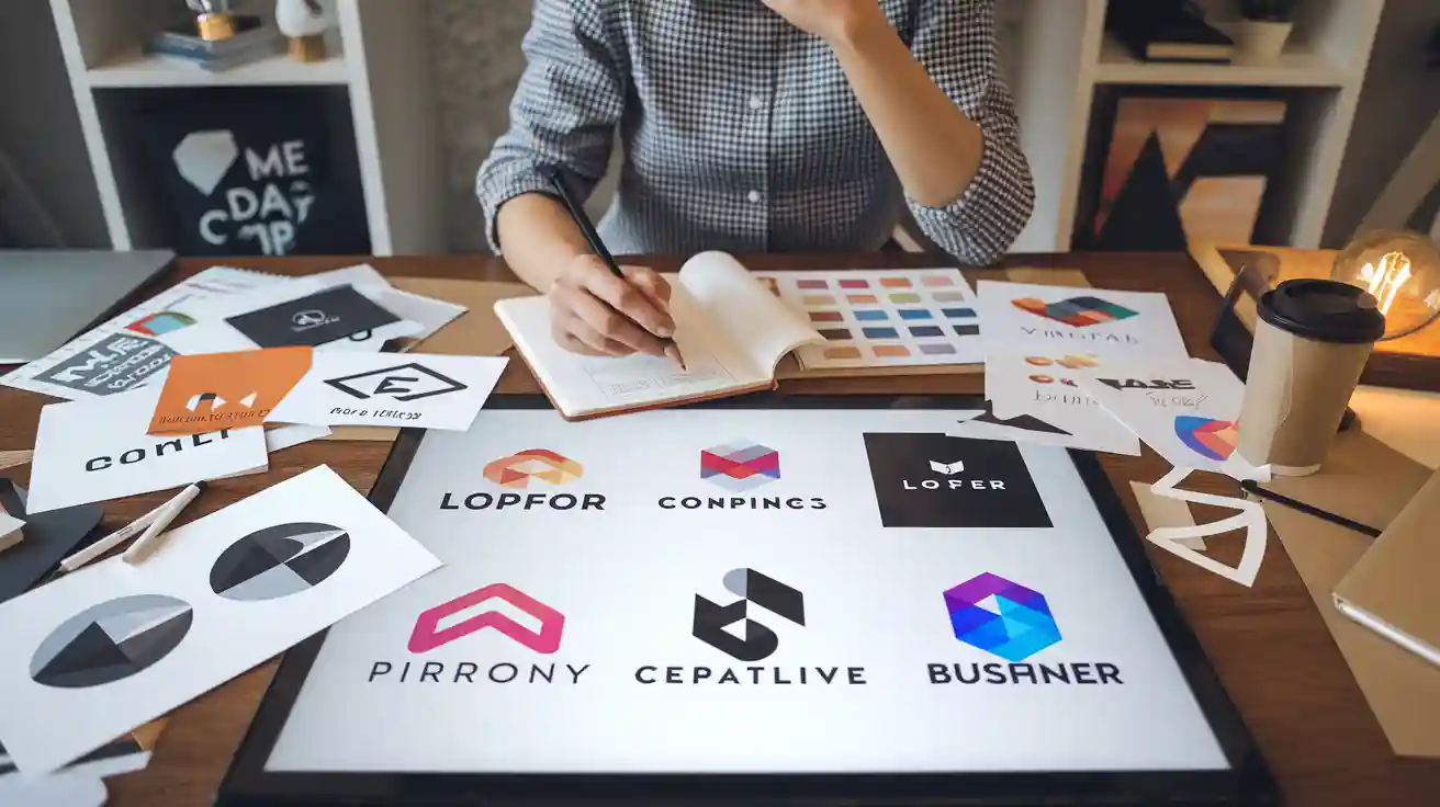
How to Select a Custom Logo
Brainstorm
You want your logo to stand out. The first step is to brainstorm. This means you gather ideas and let your creativity flow. You do not need to judge your ideas yet. Just get them out of your head and onto paper.
Start by thinking about your brand’s values. What do you want people to feel when they see your logo? Invite friends or colleagues to join you. Different people bring fresh ideas. You might see things from a new angle.
Here are some ways to make your brainstorming session more effective:
Begin with a clear overview of your brand and what it stands for.
Work with others to get different perspectives.
Write down every idea, even the wild ones. You never know which one will work.
Use inspiring images to help you think visually.
Sketch lots of ideas. You do not need to be an artist. Simple drawings help you see what works.
Tip: Look at your competitors. See what works for them. Notice which logos catch your eye. This helps you spot trends and avoid copying.
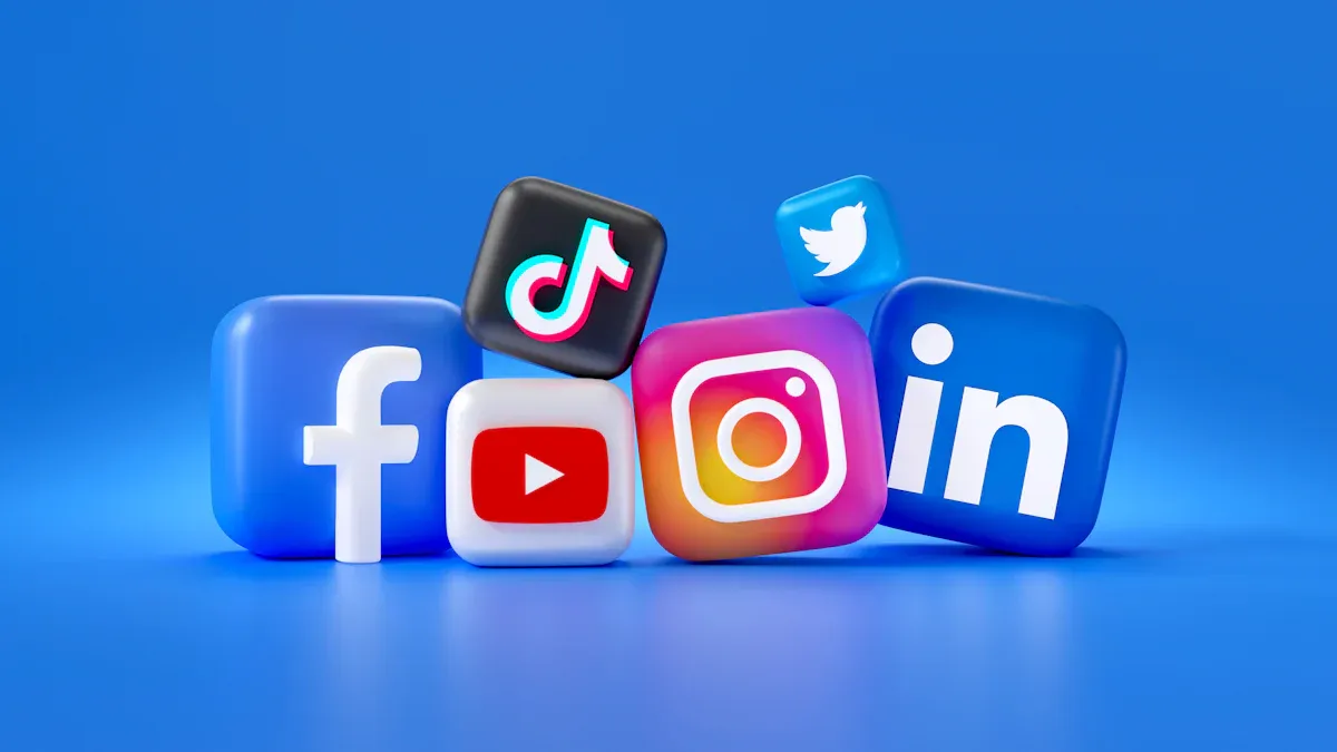
When you select a custom logo, remember to think about where you will use it. Your logo should look good on your website, social media, and packaging. If you keep this in mind, you will create a logo that works everywhere.
Colour matters too. Blue can make people trust you. Red can make them feel excited or want to buy something. The style of your logo should match your brand’s personality. Do you want something modern, vintage, or minimal? Your inspiration board will help you decide.
Mood Board
A mood board is a simple tool that helps you organise your ideas. You collect images, colours, and fonts that match your vision. This board keeps you focused on your goal.
Mood boards remind you why you started the project. They help you make small decisions that lead to your main goal. You can see which elements fit your brand and which ones do not.
Here is how a mood board helps you select a custom logo:
It gives you a clear overview of your design process.
You can spot which ideas match your brand’s story.
You avoid confusion because everything is organised.
Note: If you feel stuck, look at your mood board. It will guide you back to your original idea.
Mood boards make the creative process less stressful. You see all your ideas in one place. This makes it easier to choose the best ones for your logo.
Designer or Tool

Now you have ideas and a mood board. You need to decide how to create your logo. You can hire a professional designer or use a logo design tool. Each option has pros and cons.
Let’s look at the differences:
Aspect | Hiring a Professional Designer | Using a Logo Design Tool |
|---|---|---|
Creativity | High creativity and custom design | Limited creativity and uniqueness |
Cost | More expensive | Cost-effective, often free |
Time | Takes longer, needs collaboration | Quick and easy to use |
Quality | Professional results | May lack professional quality |
Control | Less immediate control | More control over design elements |
If you hire a designer, you get a logo tailored to your brand. Designers bring expertise and insight. They can refine your logo based on feedback. This shows your business is serious. You save time in the long run, but you pay more and wait longer for the final design.
Logo design tools are easy and fast. You control every part of the design. Most tools cost nothing. You can select a custom logo quickly. However, your logo might not look unique or professional. You may face limited options and possible copyright issues.
Alert: If you want a high-quality logo that stands out, a designer is a good choice. If you need something fast and cheap, a tool works well.
Think about your budget, timeline, and how important your logo is for your brand. When you select a custom logo, choose the method that fits your needs best.
Feedback
You have brainstormed ideas, built a mood board, and chosen your design method. Now, you need feedback. Feedback helps you see your logo from a fresh angle. You might think your design looks perfect, but others can spot things you miss.
Getting feedback is not just about asking if people like your logo. You want honest opinions. You want to know if your logo matches your brand and stands out. You want to make sure you select a custom logo that works everywhere.
Here are some easy ways to gather feedback:
Ask your target audience
Show your logo to people who might buy your products. Ask them what they feel when they see it. Do they understand your brand? Does the logo catch their eye?Share with friends and family
Friends and family give quick, honest answers. They might not know your business, but they can tell you if your logo is easy to remember.Use online communities
Post your logo in design forums or social media groups. Designers and business owners often share helpful advice. You get feedback from people with different tastes.Test in real situations
Put your logo on a mock-up of your website, packaging, or social media profile. See how it looks in action. Sometimes, a logo looks great on paper but not on a screen.
Tip: When you select a custom logo, ask for feedback on colour, shape, and readability. You want your logo to look good in black and white, as well as in colour.
You can use a simple table to organise feedback:
Source | What They Liked | What Needs Work | Suggestions |
|---|---|---|---|
Target Audience | Colours, simplicity | Font style | Try a bolder font |
Friends/Family | Memorable shape | Too many details | Remove small icons |
Online Community | Modern look | Not unique enough | Add a custom symbol |
Feedback helps you improve your logo. You do not need to change everything. Look for patterns in the comments. If many people mention the same thing, it is worth fixing.
You might feel nervous about criticism. Remember, feedback is not personal. It helps you select a custom logo that truly fits your brand. You want your logo to be strong, clear, and memorable.
Note: After you make changes, ask for feedback again. This step helps you see if your logo is ready for launch.
You can use feedback to make small tweaks or big changes. Sometimes, a tiny adjustment makes your logo much better. You want your logo to work for you, not against you.
When you listen to feedback, you build a logo that people trust. You show your audience that you care about their opinions. You make your brand stronger and more professional.
Mistakes to Avoid
Overcomplication
Sometimes, you might want your logo to look special. You may add lots of details to make it stand out. But too many shapes, colours, or fonts can cause problems. People might not remember your logo easily. They may not recognise your brand quickly.
Complex logos can confuse customers. They find it hard to know your business.
Detailed designs do not work well on small things like business cards.
If you make a complicated logo smaller, it can look messy.
Simple logos are better. Think about famous brands. Their logos use clear shapes and only a few colours. You want your logo to be easy to spot and remember. If you keep it simple, your logo will work everywhere.
Tip: Shrink your logo to the size of a coin. If you can still see what it is, your design is strong.
Inconsistency
Consistency helps your brand stay strong. If you use different logos on your website and packaging, people get confused. They might not know if it is the same business. Your logo should look the same everywhere.
Here’s a table showing what can go wrong if your logo is not consistent:
Risk Category | Description |
|---|---|
Customer Confusion | Different logos make customers question if your brand is real. |
Weakening Competitive Edge | Inconsistent branding makes it hard for customers to spot your business. |
Legal Vulnerabilities | Different trademarks can cause legal problems and claims of abandonment. |
Financial Costs | Fixing mistakes can cost money, like reprinting and legal fees. |
You want people to trust your brand. If your logo looks different in each place, people lose trust. You could also have legal trouble if your logo does not match your trademark. Fixing these mistakes can cost you time and money.
Note: Always use the same colours, fonts, and layout for your logo. This helps people recognise your brand quickly.
Copying
Copying another brand’s logo might seem easy, but it is risky. If your logo looks like someone else’s, you could get into legal trouble. Copyright problems can lead to expensive lawsuits. Your reputation could also be damaged.
Copying a logo can cause legal fights and disputes.
The London Olympic Games’ logo controversy shows how similar logos can cause trouble and hurt your brand.
Logo plagiarism is not fair. It takes away from the work of original designers and makes your brand weaker.
You want your brand to be different. If you copy a logo, people think your business is not original. They may not trust you. Making your own design shows you care about your brand and respect other creators.
Alert: Always make sure your logo is unique. Use your own ideas and do not copy others. This keeps your business safe and builds a good reputation.
Poor Versatility
You might think your logo looks great online. But have you checked it on a T-shirt or a business card? If your logo only works in one place, you could have problems. Poor versatility means your logo cannot change easily. It might look blurry when you make it small. It might lose its power in black and white. You want your logo to look good everywhere, not just on your computer.
Let’s see why versatility is important for brands today. Look at this table:
Explanation | |
|---|---|
Multi-platform Use | Logos must work well on websites, social media, print, and merchandise to keep your brand the same everywhere. |
Scalability | Logos should stay clear and strong at any size, so people can spot them whether they are big or small. |
Colour Adaptability | A good logo works in many colours, even black and white, so it always looks good in different places. |
Responsive Design | Logos need to look nice on all screen sizes and shapes, especially with more people using phones. |
Cultural Flexibility | Logos should fit different cultures but keep their main look, helping your brand grow worldwide. |
Timelessness | A versatile logo stays useful for years, so you do not have to change it often. |
If your logo is not versatile, you might face these issues:
Your brand looks different on each platform. People get mixed up and may not trust you.
The logo loses details when you make it small for social media or mobile screens.
Printing your logo in black and white makes it hard to spot.
You find it hard to use your logo in new countries or cultures.
Think about putting your logo on a mug, a banner, and a website. If it only looks good in colour, you miss many chances to show your brand. You want your logo to be flexible. It should look sharp in every size, every colour, and every place.
Tip: Try your logo in different ways. Print it, make it tiny, and check it on a phone. If it still looks good, your design is versatile.
You can stop poor versatility by keeping your logo simple. Use clear shapes and thick lines. Pick colours that go well together, but make sure your logo also works in black and white. Do not use tiny details or fancy effects. The best logos work everywhere, from a billboard to a pencil.
You want your brand to grow and reach new people. A versatile logo helps you do this. It saves you time and money because you do not need to change it every year. You build trust because people know your brand wherever they see it.
So, when you design your logo, think about what comes next. Make sure it is ready for anything. Your brand will be glad you did.
Test Your Logo
Scalability
You want your logo to look sharp everywhere. It should work on a giant billboard and a tiny business card. Scalability means your logo keeps its shape and style at any size. If you shrink it, the lines should stay clear. If you blow it up, the colours and shapes should not get blurry.
Here’s how you can test your logo’s scalability:
Set your goals. Decide what you want to measure, like how easy it is to recognise your logo at different sizes.
Pick your test method. You can use surveys or ask a group of people for feedback.
Create test materials. Put your logo on mock-ups, like T-shirts, websites, and packaging.
Run your test. Collect feedback and see how people react.
Study your results. Look for patterns and make changes if needed.
When you test, check these things:
Proportions: Your logo should keep its shape when you resize it.
Line thickness: Thin lines can disappear when small. Make sure every part stays visible.
Typography: Fonts must be easy to read, even when tiny.
Colour variations: Try your logo in black and white, or with different backgrounds.
Background compatibility: Your logo should stand out, not blend in.
Tip: Print your logo at different sizes. If you can still see every detail, you’re on the right track.
Clarity
A clear logo is easy to spot and remember. You want people to know your brand straight away. Clarity means your logo is simple, bold, and not crowded with details.
You can measure clarity in a few ways:
Run surveys. Ask people if they recognise your logo and what they remember about it.
Use focus groups. Show your logo to a small group and listen to their thoughts.
Try A/B testing. Show two versions of your logo and see which one people like more.
Ask questions like:
What do you think this logo represents?
Is it easy to read?
Does it stand out from others?
Note: If most people remember your logo after seeing it once, you’ve nailed clarity.
Feedback
Feedback helps you improve your logo. You want honest opinions from real people. Don’t just ask if they like it—dig deeper.
Best Practice | Description |
|---|---|
Use focus groups | Talk to your target customers. Ask how they feel about your logo’s colours, shapes, and fonts. |
Present multiple logo options | Show different designs. People give better feedback when they can compare. |
Conduct structured feedback sessions | Ask direct questions. Find out what words or feelings your logo brings up. |
Try these steps:
Test several versions. People give better feedback when they see choices.
Use the ‘I Like, I Wish, What If’ method. This helps people share what works and what could be better.
Ask targeted questions. Focus on colour, shape, and readability.
Alert: Listen for common themes in feedback. If many people mention the same thing, it’s worth changing.
Adjust
You have gathered feedback and tested your logo. Now comes the important part—making adjustments. This step helps you turn a good logo into a great one. You want your logo to work everywhere and connect with your audience. Adjusting your logo is not just about changing colours or shapes. It is about making sure your logo matches your brand and stands out.
Start by looking at all the feedback you received. Did people find your logo easy to read? Did they remember it after seeing it once? Maybe someone said the colours felt too dull, or the font looked too fancy. Write down the main points. You do not need to change everything, but you should focus on the comments that came up the most.
Tip: If you hear the same feedback from different people, it is a sign you should pay attention.
Next, test your logo again after you make changes. Sometimes, a small tweak can make a big difference. You might need to try a few versions before you find the best one. Do not rush this step. Take your time and see how each version looks in real life.
To help you decide what to do, you can use a simple process. Check if your changes made a real difference. You can use tools like Excel to compare results from your tests. Look at things like how many people liked the new version or if more people remembered your logo.
Here is a handy table to guide you through the adjustment process:
Step | Description |
|---|---|
1 | Measure the significance of your results. Use a tool like Excel to see if your changes made a big impact. |
2 | Take action based on what you find. If one version works better, use it. If both versions are similar, keep your original logo or try a new design. |
You might feel unsure about making changes. That is normal. Remember, even big brands update their logos over time. You can always test again if you are not sure. The goal is to create a logo that feels right for your brand and your audience.
Here are some quick steps to help you adjust your logo:
List the main feedback points.
Make small changes first, like adjusting colours or font size.
Test the new version with your audience.
Compare the results using a simple chart or table.
Choose the version that works best.
Note: Adjusting your logo is not a one-time job. You can always improve it as your brand grows.
Keep your process simple. Listen to your audience. Trust your instincts. With each adjustment, your logo will get stronger and more memorable.
You can make a logo that matches your brand by using these easy steps:
Use special colours or shapes so people remember it.
Keep your logo simple so anyone can draw it.
Make sure your logo works everywhere you use it.
Pick a design that will not go out of style.
Check that your logo connects with your audience.
A custom logo helps people know your brand and trust it. Tangbuy’s private labelling and logo customisation services help you stand out from others.
Benefit | Description |
|---|---|
Your logo shows who your brand is. | |
Builds Trust and Credibility | Customers think your brand is reliable. |
Encourages Customer Loyalty | People remember your brand and come back. |
Begin your logo journey now. Your brand should stand out! 🚀
FAQ
What makes a logo “custom” for my brand?
A custom logo is unique to your business. You choose the colours, shapes, and style. It shows your brand’s personality. No one else has the same design. You stand out from the crowd.
How many colours should I use in my logo?
Try to use two or three main colours. Too many colours can make your logo look messy. Simple colour choices help people remember your brand. Test your logo in black and white as well.
Can I design a logo myself without any experience?
Yes, you can! Many online tools help beginners create logos. You do not need to be an artist. Start with simple shapes and fonts. Ask for feedback from friends or customers.
How do I know if my logo is effective?
Ask yourself these questions:
Is it easy to recognise?
Does it look good in different sizes?
Do people remember it? If you answer “yes” to these, your logo works well.
Should I update my logo as my business grows?
You might need to update your logo if your brand changes. Small tweaks can keep your logo fresh. Big changes are not always needed. Listen to your customers and watch your industry.
What file types do I need for my logo?
You need different files for different uses.
PNG for websites and social media
SVG or EPS for printing
JPEG for simple sharing
Ask your designer or tool for these formats.
Can I use free images or icons in my logo?
Be careful with free images. Many have copyright rules. Your logo should be original. If you use free icons, check the licence. It is safer to create your own or hire a designer.

TangBuy: A Smarter Way to Dropship in 2025
If you're looking to stay competitive with dropshipping in 2025, speed and trend-awareness are key. TangBuy helps you stay ahead with real-time product trends, fast fulfilment, and factory-direct sourcing. With over 1 million ready-to-ship items, 24-hour order processing, and seamless Shopify integration, TangBuy makes it easier to test, scale, and succeed in today's fast-moving eCommerce landscape.
See Also
Best Free Logo Creation Tools for Your Brand in 2025
Comprehensive Guide to Establishing a Robust Facebook Presence
Advantages of Selling Private Label Coffee Mugs for New Dropshippers
Selecting and Ordering Custom Wedding Candles in Bulk for 2025
Deciding Between Dropshippers and Wholesalers for Your Enterprise